


Client
Billo AB
contribution
Design Concept, UX/UI Design & Design System
Team
Cross-functional
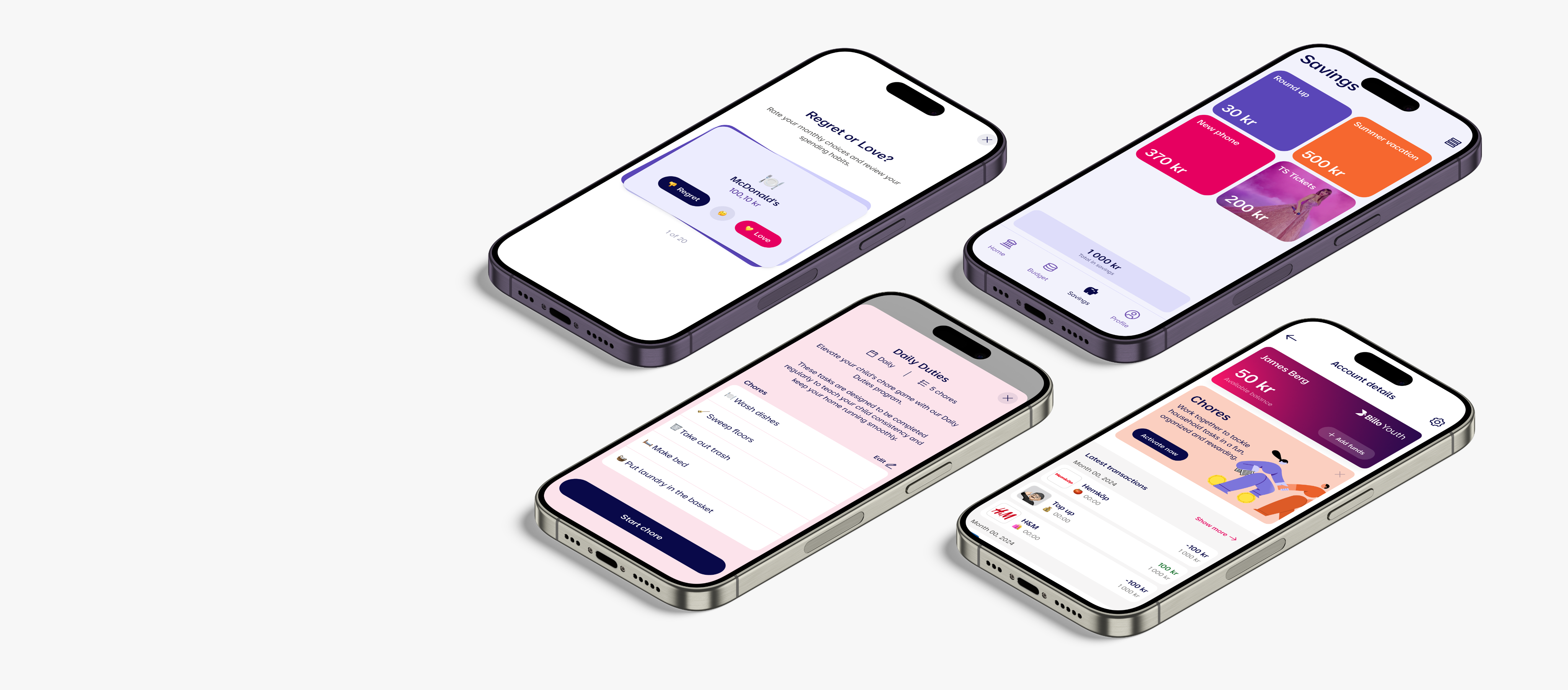
Billo Youth is a financial education app built to help kids develop healthy money habits with full visibility and support from their parents. The app offers a dual-audience experience, balancing simplicity and engagement
Building financial independence
Designing for trust, learning, and engagement
Billo Youth is a financial education app designed to help kids learn how to manage money with full visibility and support from their parents.
The app offers a dual-audience experience, balancing simplicity and engagement for kids. The goal was to create a platform that drives measurable behavior change while staying intuitive, fun, and trustworthy for both sides.
I led the end-to-end design for Billo Youth from early concept definition to UX/UI design and systemization. My focus was on crafting an experience that felt approachable, empowering and fun for kids, while giving parents the right tools to guide their child’s financial journey.
Design concept
I helped define the core product vision and interaction model for a dual-audience app. This meant translating abstract concepts like “saving” or “earning” into playful, age-appropriate experiences while preserving trust and clarity.
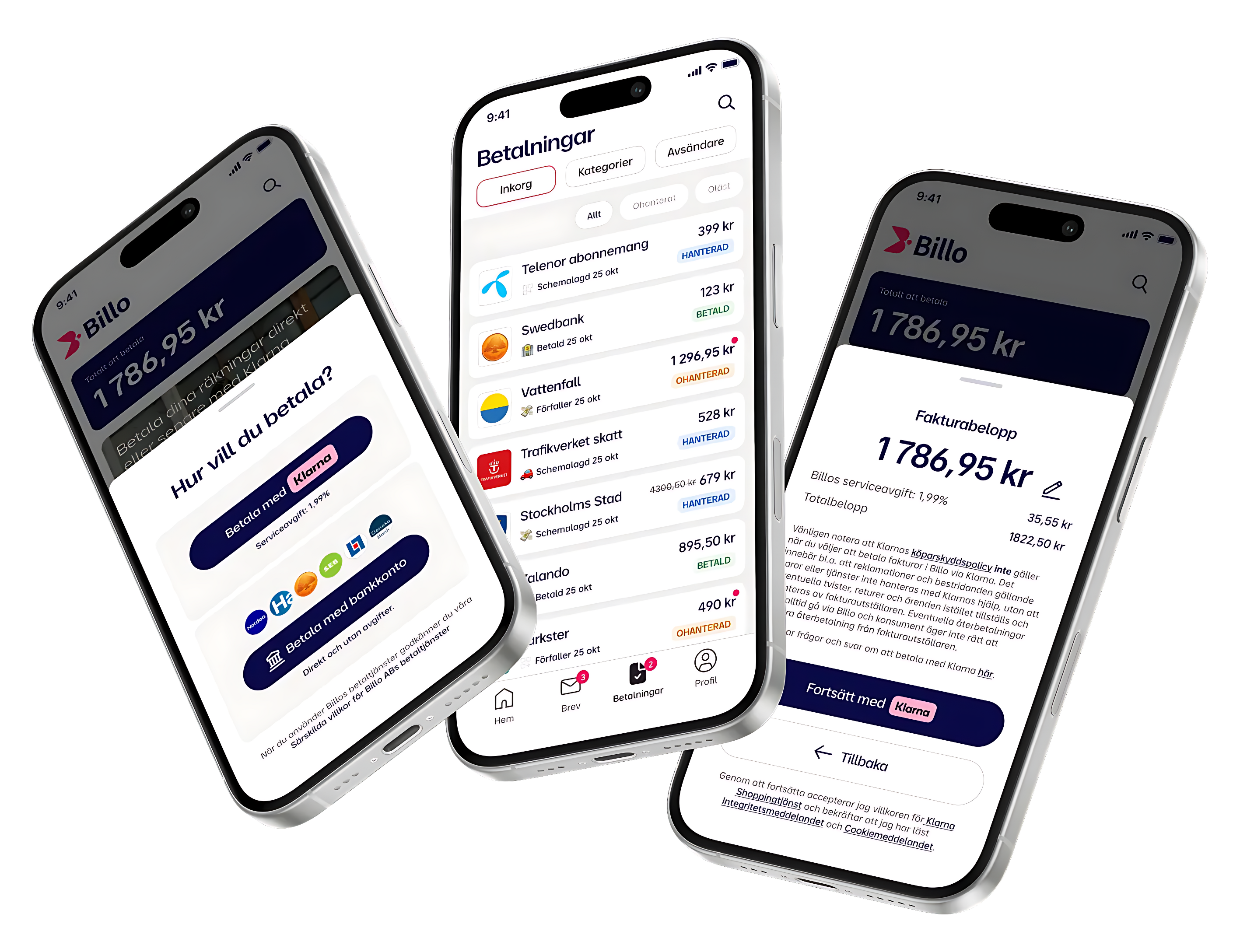
Billo is a government-approved digital mailbox that helps users pay bills on time with the market’s fastest payment solution.
Discovery
Problem & Goals
Billo Youth was a brand-new product conceived under the trusted Billo umbrella, designed to help parents teach their children about money through a secure, engaging app experience.
The challenge was to design a dual-audience platform that served two distinct users, parents and children, each with their own needs, motivations, and expectations.
Project goals
– Design a seamless, duo-user experience tailored to both parent and child.
– Build trust and control into the parent interface.
– Infuse playfulness and learning into the youth interface.
– Reduce onboarding friction and boost weekly engagement.
– Create a scalable design system to support future features like chores, rewards, and savings goals.
Definition
Key insights
Parents prioritized control and safety
They wanted to approve transactions, set limits, and feel in control of the experience.
Kids needed independence and simplicity
They got excited by visual goals, gamified experiences, and progress tracking.
Shared tasks like saving, and managing funds
Needed mirrored but adapted experiences on both sides.
75% of parents in the Nordic countries are starting to use digital debit cards or mobile apps to manage their children's spending and savings.
45% of parents in Sweden actively use digital solutions to manage their children's pocket money, providing control over spending and promoting financial education.
80% of Swedish parents using digital pocket money tools have reported that these tools help facilitate conversations about saving, budgeting, and spending.
Design System
Foundations for a future-ready product ecosystem
As the main designer, I built Billo’s design system from the ground up, supporting the launch of Billo Youth and laying the groundwork for scaling the main Billo app.
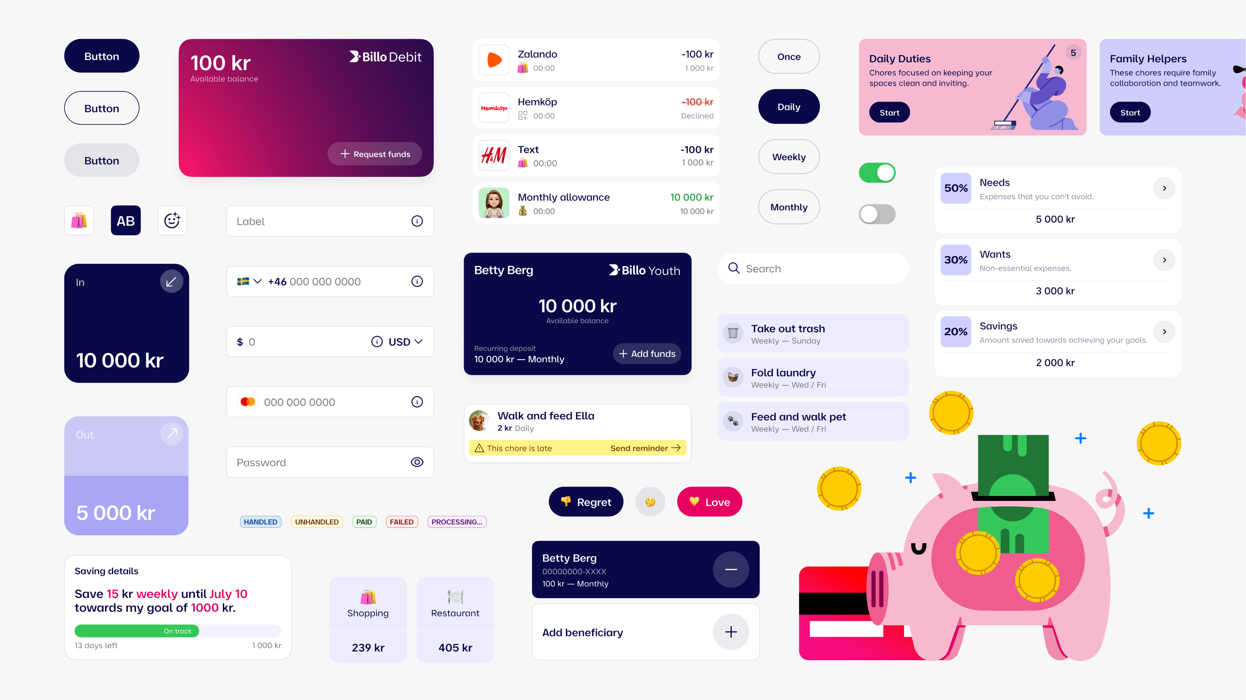
The system was designed for clarity, modularity, and cross-platform efficiency, enabling consistent experiences across both parent and youth interfaces. I defined foundational principles, created token-based styles, and built a flexible library of components with clear naming and usage guidelines.
Close collaboration with front-end developers ensured seamless handoff, technical feasibility, and a scalable system ready for rapid iteration and long-term growth.
Foundation
– Established a split visual language tailored to both parent and youth audiences.
– Designed a system grid, color palette, and type hierarchy optimized for contrast, readability, and accessibility.
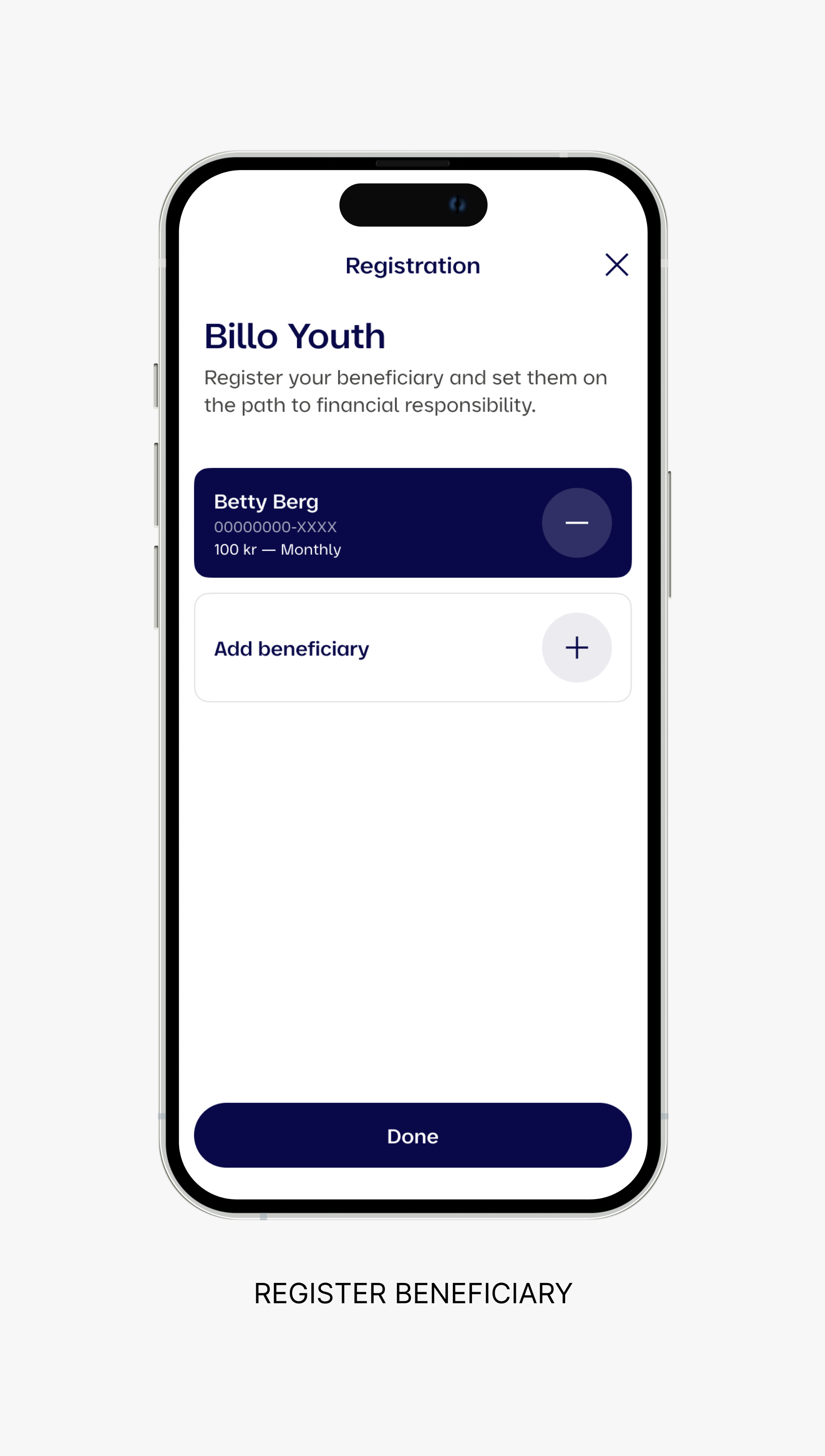
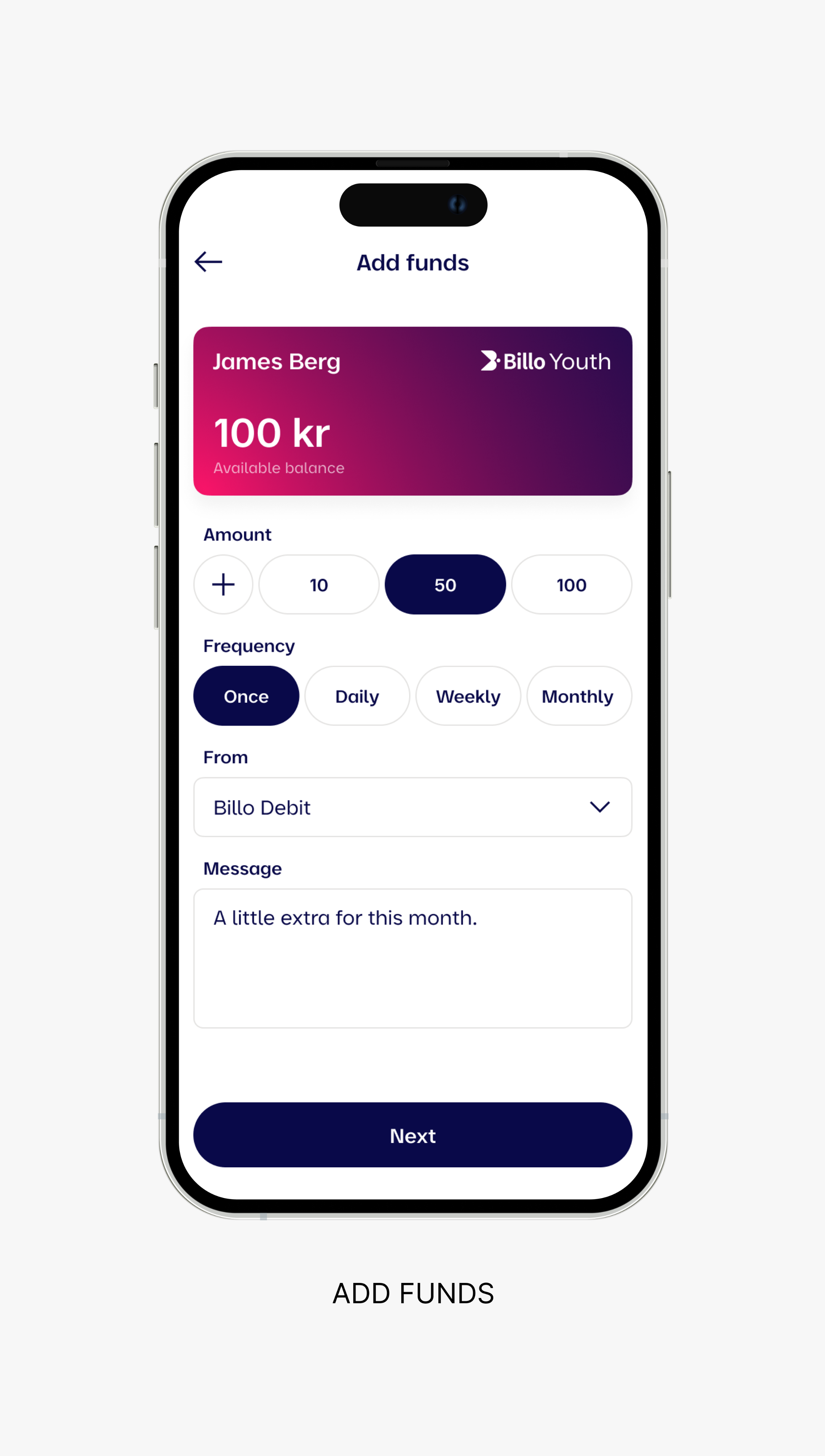
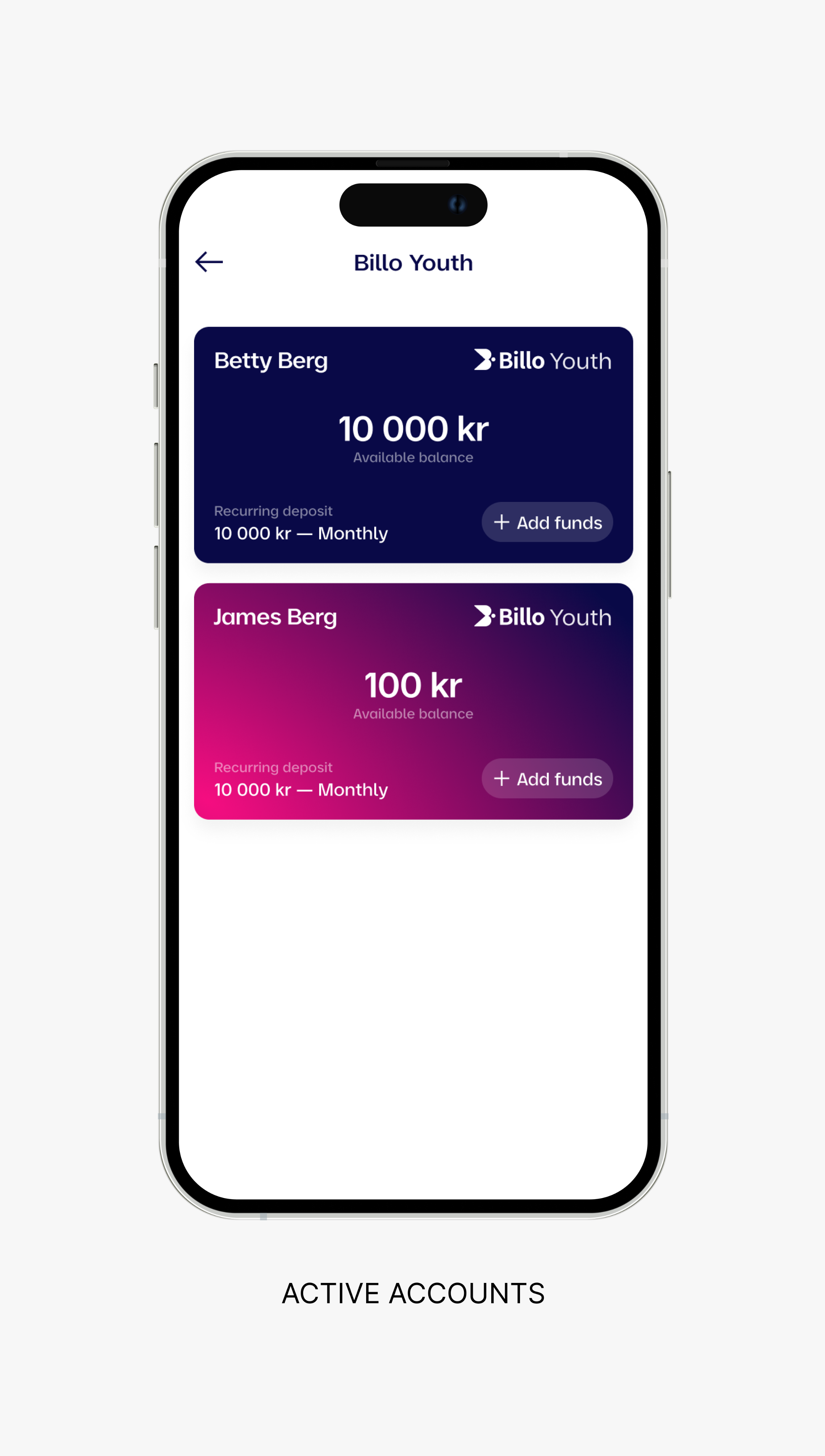
– Defined distinct UI states for trust-based interactions like approvals, fund transfers, and savings tracking.
Components
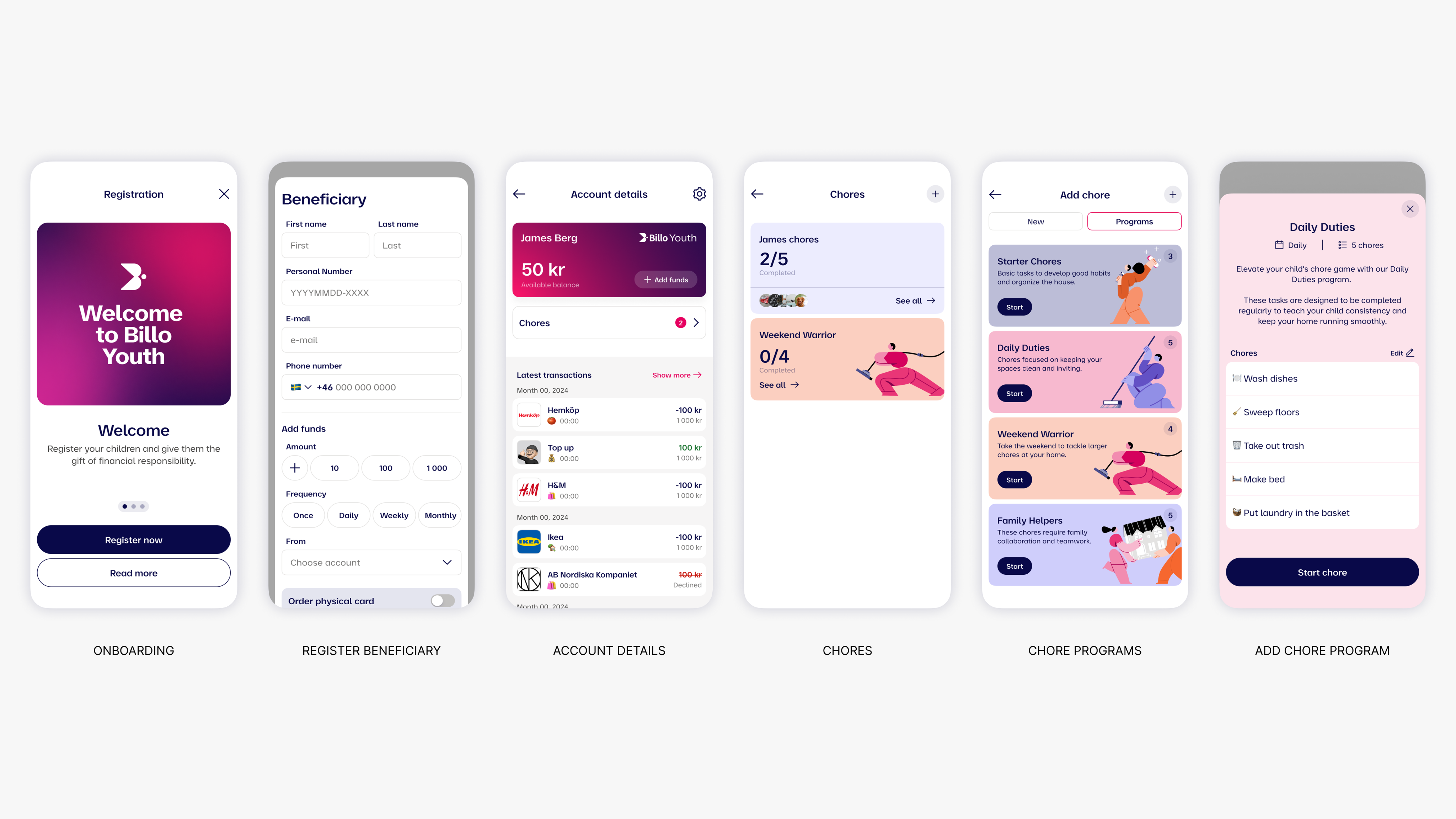
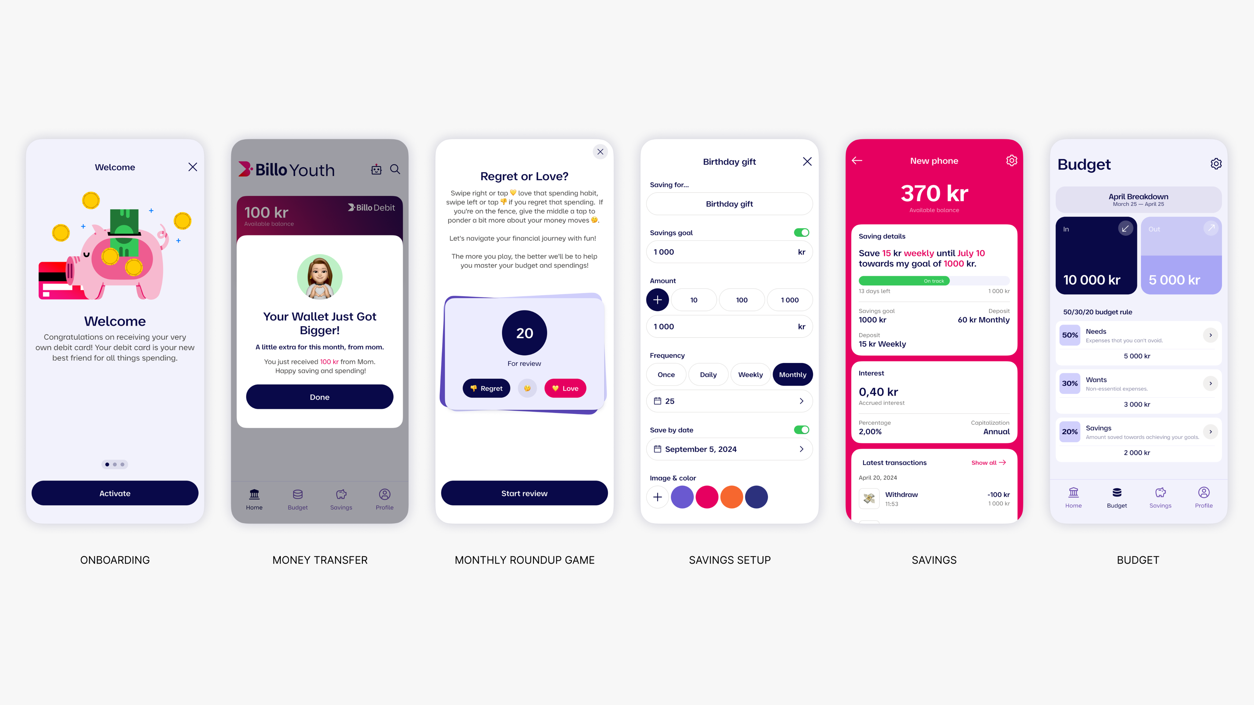
– Developed a modular card system for tasks, rewards, and notifications, with contextual variations for each user type.
– Built a unified onboarding framework with tailored content, illustrations, and flows per audience.
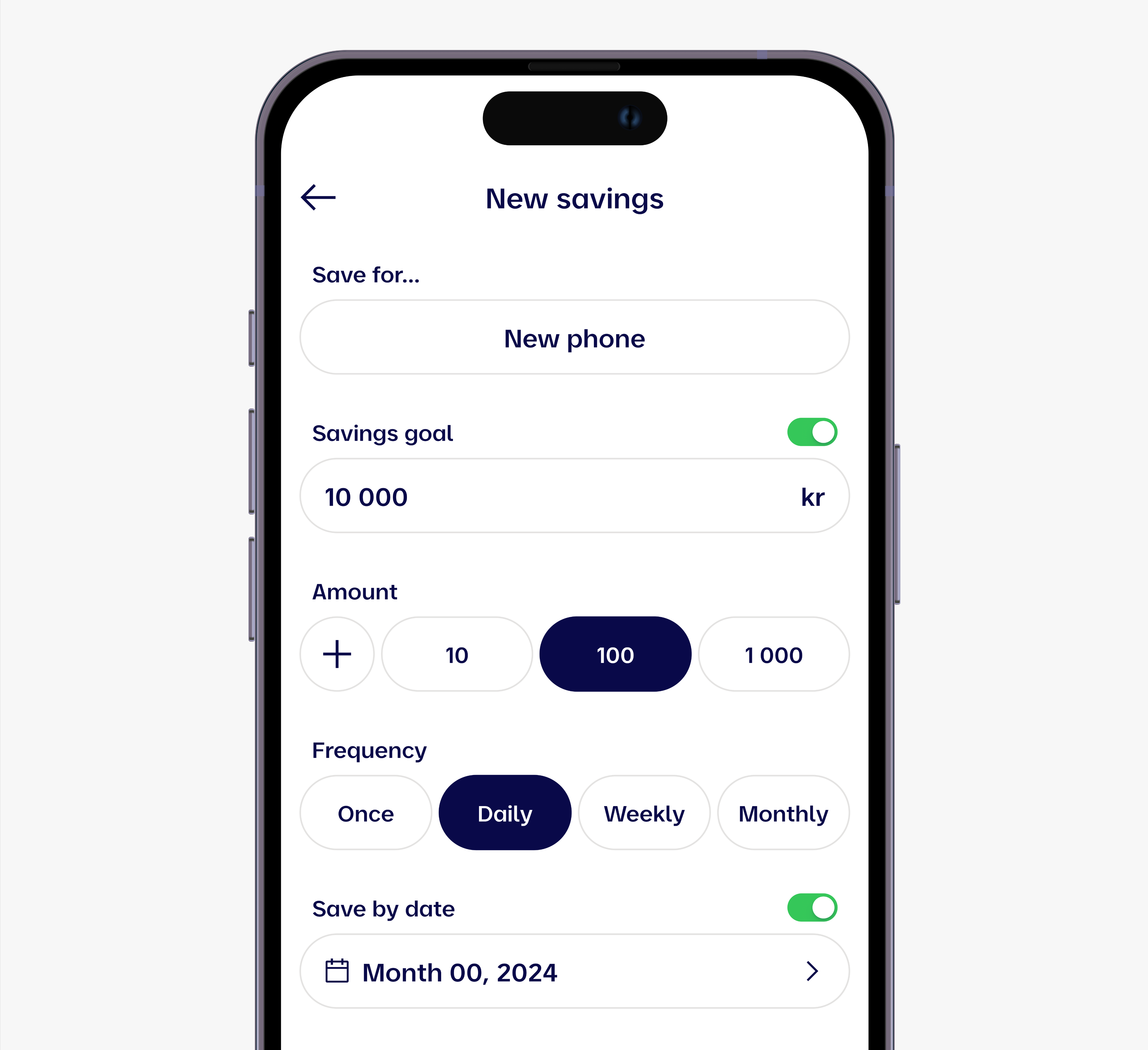
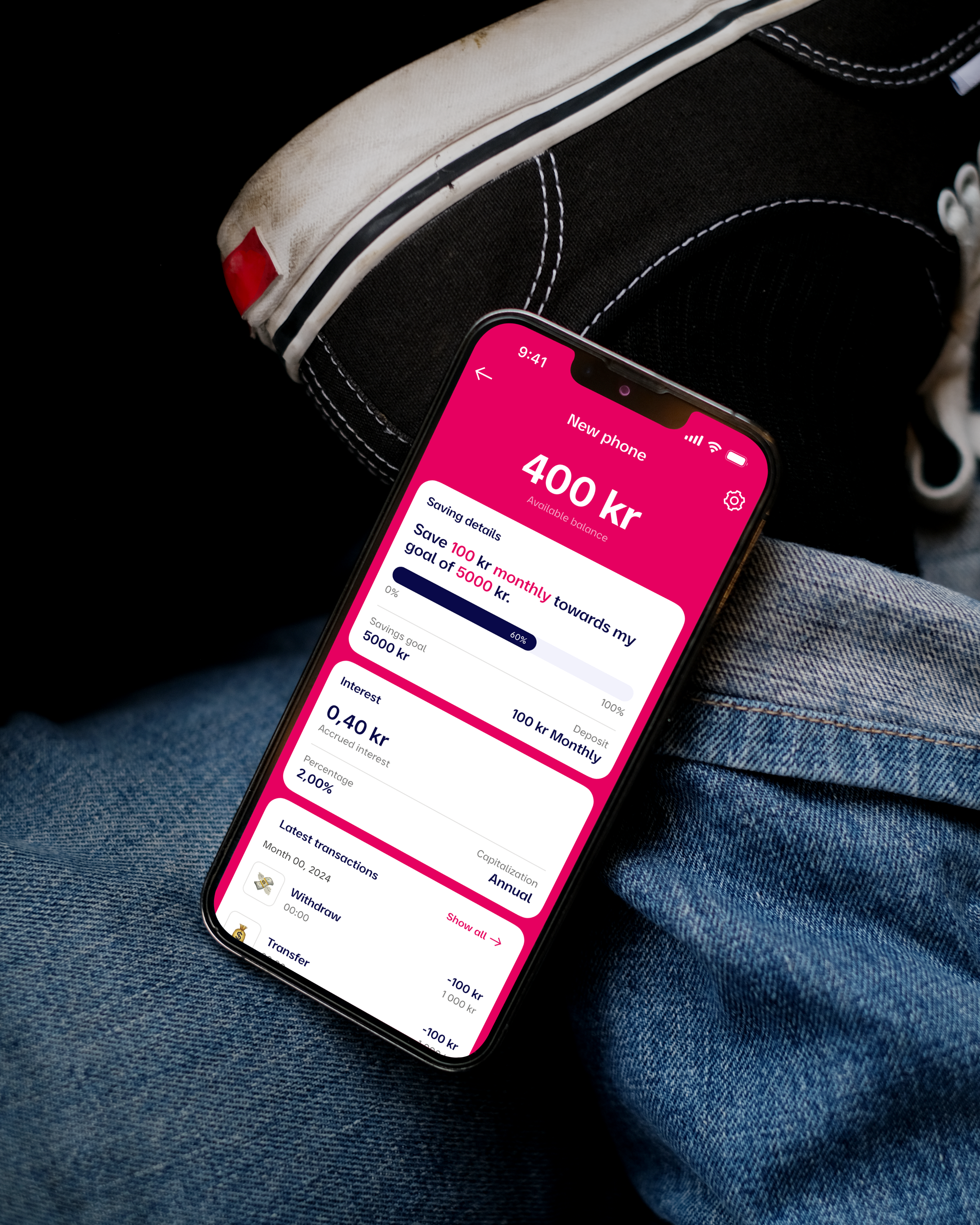
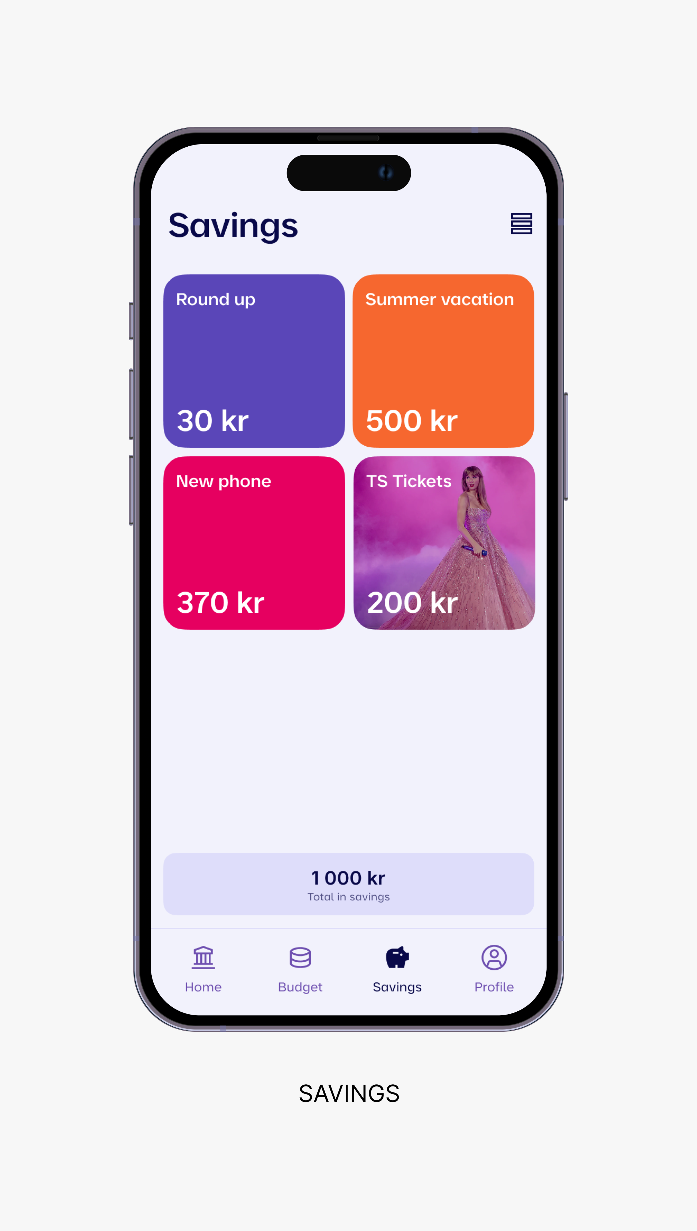
– Designed interactive progress features—like visual savings goals—to keep young users engaged and motivated.
Collaboration & Handoff
– Paired closely with front-end engineers to align on feasibility and system behavior.
– Created consistent naming conventions and documentation to support long-term maintainability and adoption across teams.
Research & Design
Designing for two users, one shared experience
To support real behavior change, we needed to design two connected experiences: one for parents, focused on control, clarity, and oversight, and one for kids, focused on engagement, simplicity, and learning.
Through early concept testing and user validation, I identified key interaction patterns that could support both audiences without compromising usability or safety. The design prioritized transparency, responsiveness, and a sense of progress, helping kids build positive financial habits, and giving parents confidence and visibility.
For Parents
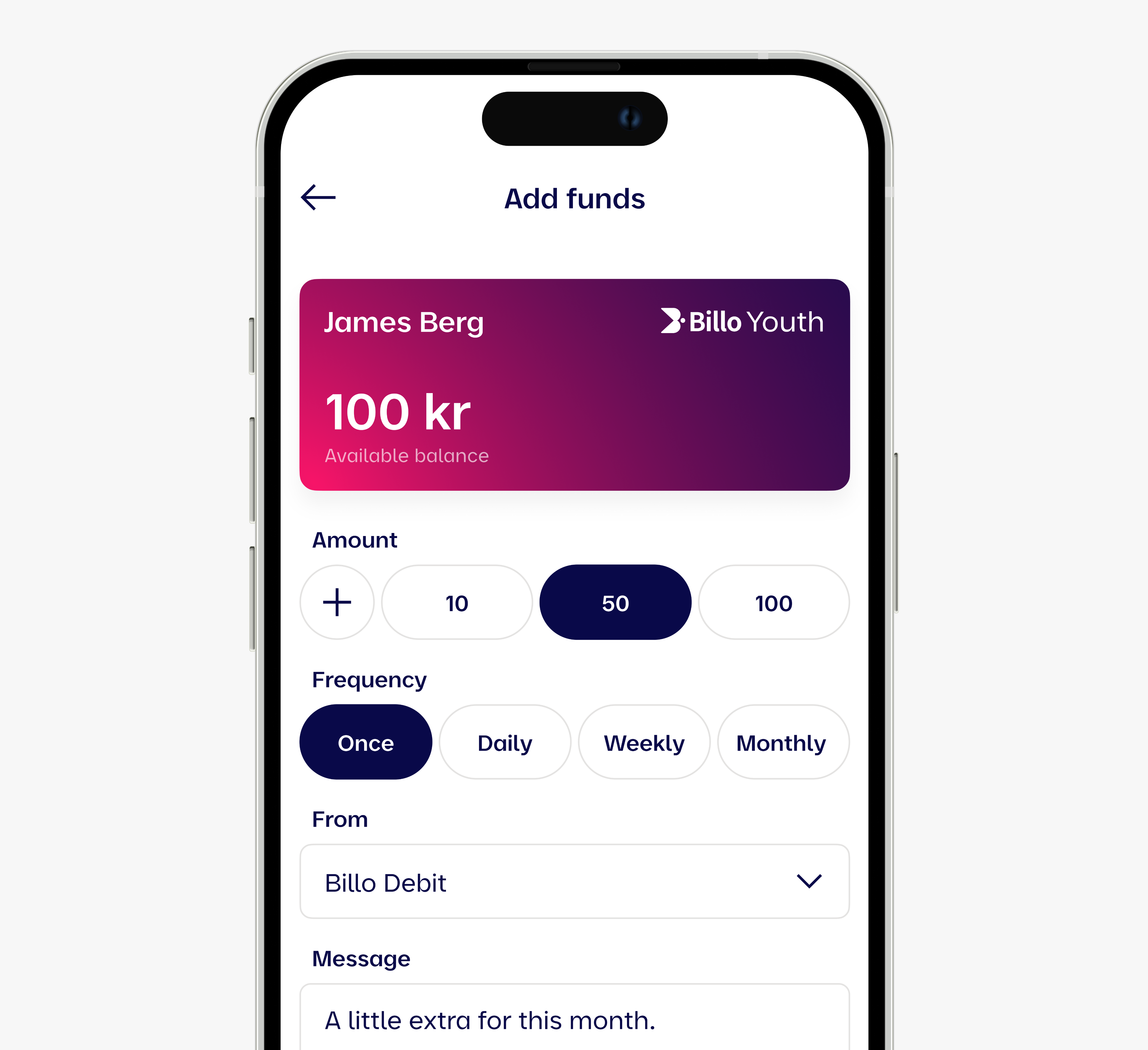
– Parental controls with real-time approvals and fund transfers.
– Financial insights and activity reporting.
– A simple, intuitive onboarding and setup flow.
For Youth
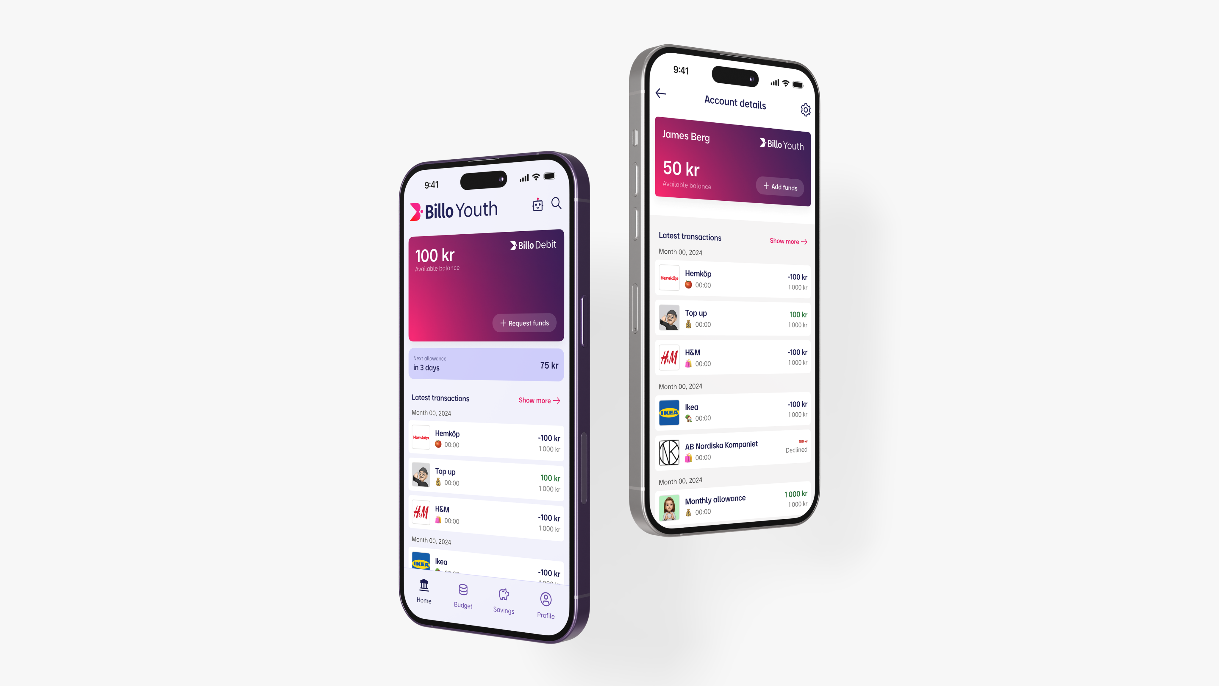
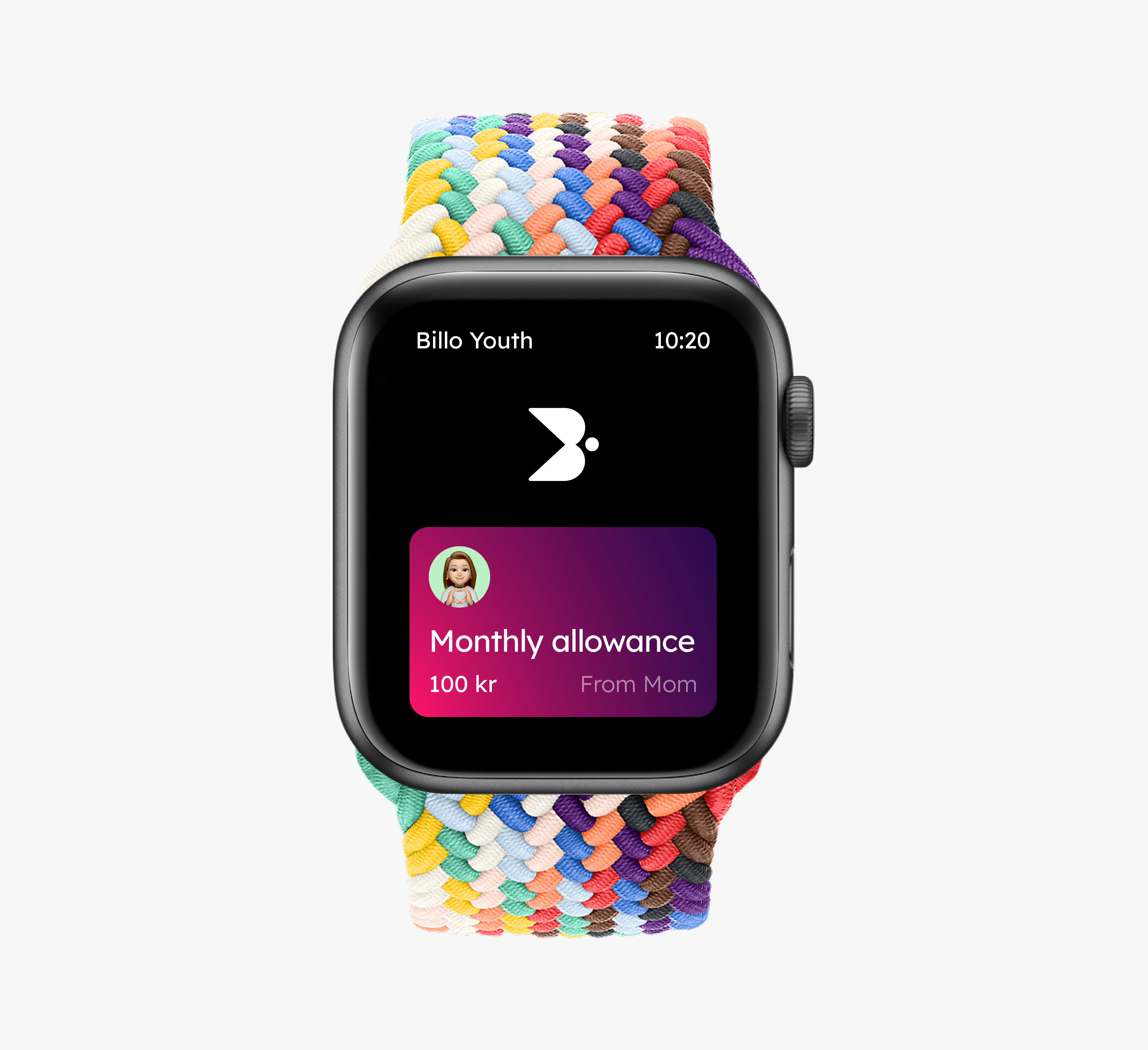
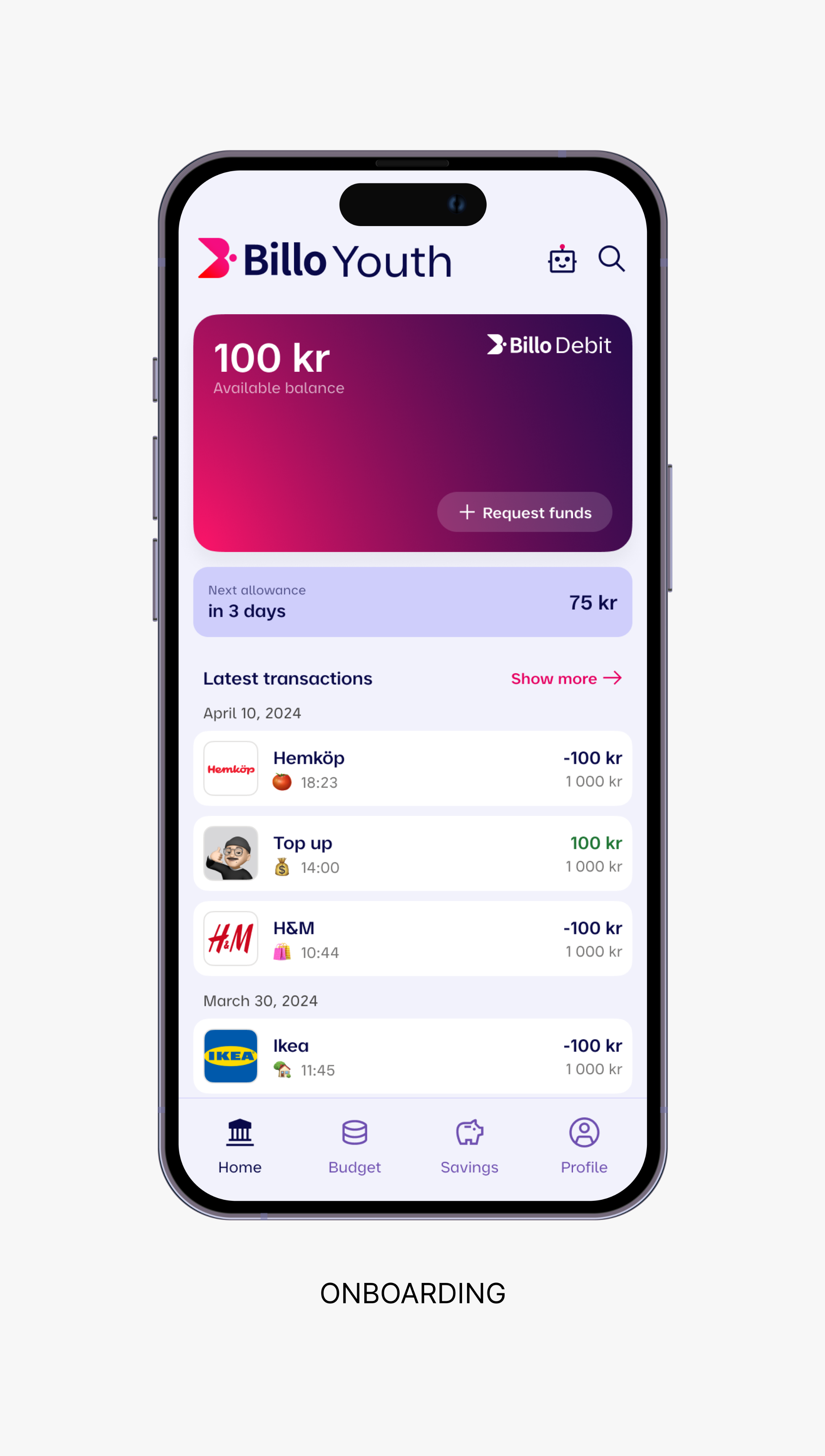
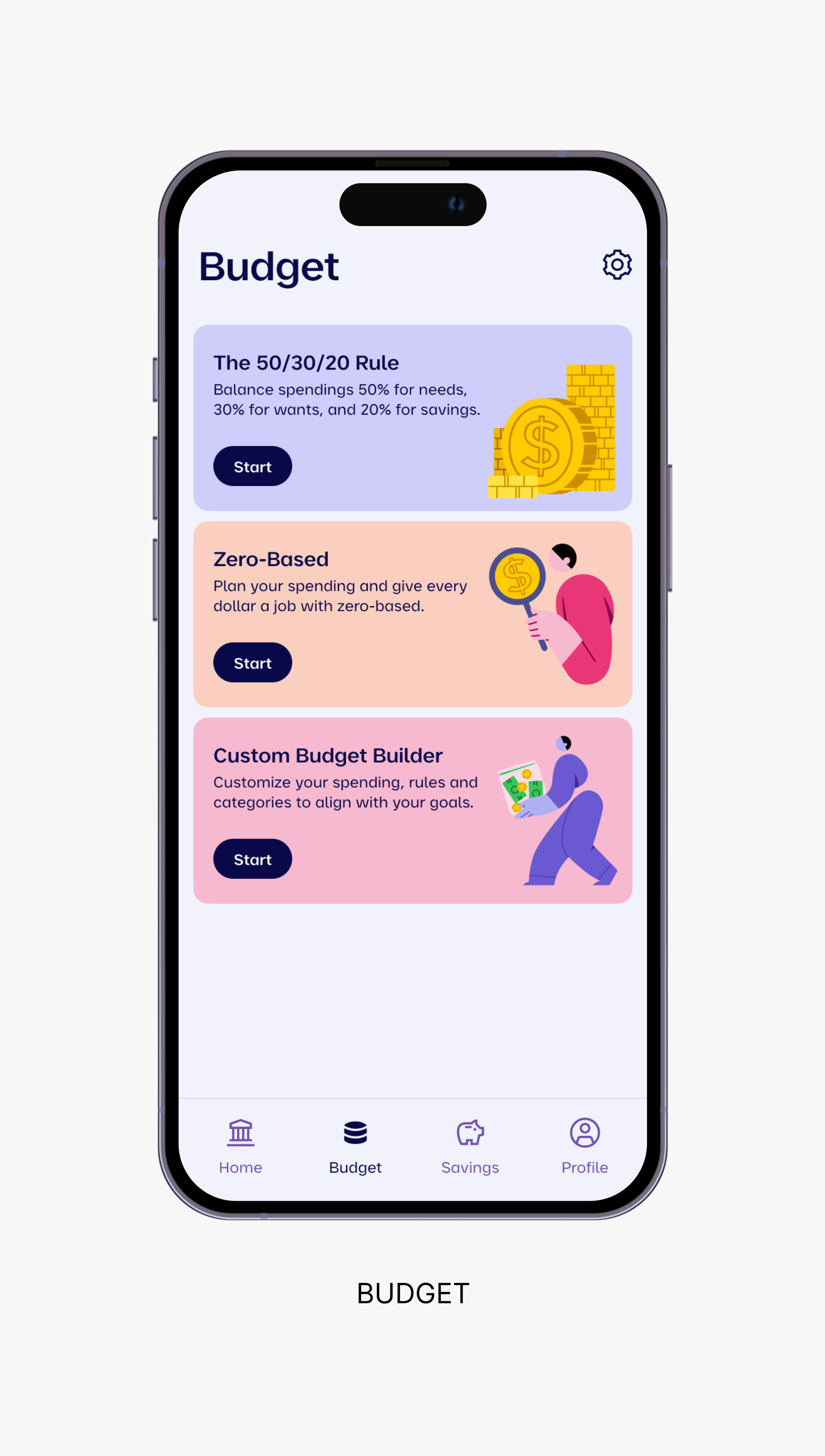
– Gamified savings goals and progress tracking.
– A user-friendly interface with intuitive gestures.
– Interactive financial learning moments woven into everyday actions.
– Strong emphasis on privacy and security.
– Personalization through avatars, naming, and goal-setting.
For Both
– Mirrored flows to create linked experiences (e.g. requests, chores, limits).
– Seamless communication between parent and child accounts.
– A unified design system enabling rapid iteration, scalability, and brand cohesion.
Client
Billo AB
contribution
Design Concept, UX/UI Design & Design System
Team
Cross-functional
Billo Youth is a financial education app built to help kids develop healthy money habits with full visibility and support from their parents. The app offers a dual-audience experience, balancing simplicity and engagement
Building financial independence
Designing for trust, learning, and engagement
Billo Youth is a financial education app designed to help kids learn how to manage money with full visibility and support from their parents.
The app offers a dual-audience experience, balancing simplicity and engagement for kids. The goal was to create a platform that drives measurable behavior change while staying intuitive, fun, and trustworthy for both sides.
I led the end-to-end design for Billo Youth from early concept definition to UX/UI design and systemization. My focus was on crafting an experience that felt approachable, empowering and fun for kids, while giving parents the right tools to guide their child’s financial journey.
Design concept
I helped define the core product vision and interaction model for a dual-audience app. This meant translating abstract concepts like “saving” or “earning” into playful, age-appropriate experiences while preserving trust and clarity.
Lorem ipsum dolor sit amet consectetu met volutpat sit ac sed non it donec malesuada amet est sit amet consectetu met orem ipsum dolor sit amet consectetu met volutpat sit ac sed non it donec malesuada amet est sit amet consectetu met lorem ipsum dolor sit amet consectetu met.
Discovery
Problem & Goals
Billo Youth was a brand-new product conceived under the trusted Billo umbrella, designed to help parents teach their children about money through a secure, engaging app experience.
The challenge was to design a dual-audience platform that served two distinct users, parents and children, each with their own needs, motivations, and expectations.
Project goals
– Design a seamless, duo-user experience tailored to both parent and child.
– Build trust and control into the parent interface.
– Infuse playfulness and learning into the youth interface.
– Reduce onboarding friction and boost weekly engagement.
– Create a scalable design system to support future features like chores, rewards, and savings goals.
Definition
Key insights
Parents prioritized control and safety
They wanted to approve transactions, set limits, and feel in control of the experience.
Kids needed independence and simplicity
They got excited by visual goals, gamified experiences, and progress tracking.
Shared tasks like saving, and managing funds
Needed mirrored but adapted experiences on both sides.
75% of parents in the Nordic countries are starting to use digital debit cards or mobile apps to manage their children's spending and savings.
45% of parents in Sweden actively use digital solutions to manage their children's pocket money, providing control over spending and promoting financial education.
80% of Swedish parents using digital pocket money tools have reported that these tools help facilitate conversations about saving, budgeting, and spending.
Design System
Foundations for a future-ready product ecosystem
As the main designer, I built Billo’s design system from the ground up, supporting the launch of Billo Youth and laying the groundwork for scaling the main Billo app.
The system was designed for clarity, modularity, and cross-platform efficiency, enabling consistent experiences across both parent and youth interfaces. I defined foundational principles, created token-based styles, and built a flexible library of components with clear naming and usage guidelines.
Close collaboration with front-end developers ensured seamless handoff, technical feasibility, and a scalable system ready for rapid iteration and long-term growth.
Foundation
– Established a split visual language tailored to both parent and youth audiences.
– Designed a system grid, color palette, and type hierarchy optimized for contrast, readability, and accessibility.
– Defined distinct UI states for trust-based interactions like approvals, fund transfers, and savings tracking.
Components
– Developed a modular card system for tasks, rewards, and notifications, with contextual variations for each user type.
– Built a unified onboarding framework with tailored content, illustrations, and flows per audience.
– Designed interactive progress features—like visual savings goals—to keep young users engaged and motivated.
Collaboration & Handoff
– Paired closely with front-end engineers to align on feasibility and system behavior.
– Created consistent naming conventions and documentation to support long-term maintainability and adoption across teams.
Research & Design
Designing for two users, one shared experience
To support real behavior change, we needed to design two connected experiences: one for parents, focused on control, clarity, and oversight, and one for kids, focused on engagement, simplicity, and learning.
Through early concept testing and user validation, I identified key interaction patterns that could support both audiences without compromising usability or safety. The design prioritized transparency, responsiveness, and a sense of progress, helping kids build positive financial habits, and giving parents confidence and visibility.
For Parents
– Parental controls with real-time approvals and fund transfers.
– Financial insights and activity reporting.
– A simple, intuitive onboarding and setup flow.
For Youth
– Gamified savings goals and progress tracking.
– A user-friendly interface with intuitive gestures.
– Interactive financial learning moments woven into everyday actions.
– Strong emphasis on privacy and security.
– Personalization through avatars, naming, and goal-setting.
For Both
– Mirrored flows to create linked experiences (e.g. requests, chores, limits).
– Seamless communication between parent and child accounts.
– A unified design system enabling rapid iteration, scalability, and brand cohesion.


Client
Billo AB
contribution
Design Concept, UX/UI Design & Design System
Team
Cross-functional
Billo Youth is a financial education app built to help kids develop healthy money habits with full visibility and support from their parents. The app offers a dual-audience experience, balancing simplicity and engagement
Building financial independence
Designing for trust, learning, and engagement
Billo Youth is a financial education app designed to help kids learn how to manage money with full visibility and support from their parents.
The app offers a dual-audience experience, balancing simplicity and engagement for kids. The goal was to create a platform that drives measurable behavior change while staying intuitive, fun, and trustworthy for both sides.
I led the end-to-end design for Billo Youth from early concept definition to UX/UI design and systemization. My focus was on crafting an experience that felt approachable, empowering and fun for kids, while giving parents the right tools to guide their child’s financial journey.
Design concept
I helped define the core product vision and interaction model for a dual-audience app. This meant translating abstract concepts like “saving” or “earning” into playful, age-appropriate experiences while preserving trust and clarity.
Billo is a government-approved digital mailbox that helps users pay bills on time with the market’s fastest payment solution.
Discovery
Problem & Goals
Billo Youth was a brand-new product conceived under the trusted Billo umbrella, designed to help parents teach their children about money through a secure, engaging app experience.
The challenge was to design a dual-audience platform that served two distinct users, parents and children, each with their own needs, motivations, and expectations.
Project goals
– Design a seamless, duo-user experience tailored to both parent and child.
– Build trust and control into the parent interface.
– Infuse playfulness and learning into the youth interface.
– Reduce onboarding friction and boost weekly engagement.
– Create a scalable design system to support future features like chores, rewards, and savings goals.
Definition
Key insights
Parents prioritized control and safety
They wanted to approve transactions, set limits, and feel in control of the experience.
Kids needed independence and simplicity
They got excited by visual goals, gamified experiences, and progress tracking.
Shared tasks like saving, and managing funds
Needed mirrored but adapted experiences on both sides.
75% of parents in the Nordic countries are starting to use digital debit cards or mobile apps to manage their children's spending and savings.
45% of parents in Sweden actively use digital solutions to manage their children's pocket money, providing control over spending and promoting financial education.
80% of swedish parents using digital pocket money tools have reported that these tools help facilitate conversations about saving, budgeting, and spending.
Design System
Foundations for a future-ready product ecosystem
As the main designer, I built Billo’s design system from the ground up, supporting the launch of Billo Youth and laying the groundwork for scaling the main Billo app.
The system was designed for clarity, modularity, and cross-platform efficiency, enabling consistent experiences across both parent and youth interfaces. I defined foundational principles, created token-based styles, and built a flexible library of components with clear naming and usage guidelines.
Close collaboration with front-end developers ensured seamless handoff, technical feasibility, and a scalable system ready for rapid iteration and long-term growth.
Foundation
– Established a split visual language tailored to both parent and youth audiences.
– Designed a system grid, color palette, and type hierarchy optimized for contrast, readability, and accessibility.
– Defined distinct UI states for trust-based interactions like approvals, fund transfers, and savings tracking.
Components
– Developed a modular card system for tasks, rewards, and notifications, with contextual variations for each user type.
– Built a unified onboarding framework with tailored content, illustrations, and flows per audience.
– Designed interactive progress features—like visual savings goals—to keep young users engaged and motivated.
Collaboration & Handoff
– Paired closely with front-end engineers to align on feasibility and system behavior.
– Created consistent naming conventions and documentation to support long-term maintainability and adoption across teams.
Research & Design
Designing for two users, one shared experience
To support real behavior change, we needed to design two connected experiences: one for parents, focused on control, clarity, and oversight, and one for kids, focused on engagement, simplicity, and learning.
Through early concept testing and user validation, I identified key interaction patterns that could support both audiences without compromising usability or safety. The design prioritized transparency, responsiveness, and a sense of progress, helping kids build positive financial habits, and giving parents confidence and visibility.
For Parents
– Parental controls with real-time approvals and fund transfers.
– Financial insights and activity reporting.
– A simple, intuitive onboarding and setup flow.
For Youth
– Gamified savings goals and progress tracking.
– A user-friendly interface with intuitive gestures.
– Interactive financial learning moments woven into everyday actions.
– Strong emphasis on privacy and security.
– Personalization through avatars, naming, and goal-setting.
For Both
– Mirrored flows to create linked experiences (e.g. requests, chores, limits).
– Seamless communication between parent and child accounts.
– A unified design system enabling rapid iteration, scalability, and brand cohesion.